About L'Heure Bleue At Home

Shop Photo Gallery

Offers and Discount Codes

Sunday, 22 December 2013

Vintage Christmas Trees

I can't believe that Christmas is almost upon us!  The year has gone by with the speed of light. Sometimes I feel like I have hardly any time to breathe.   I'm still tweaking my Christmas decorations.  Somehow, quite by happenstance (isn't that always the way?) I ended up with a collection of vintage ceramic Christmas trees, all of them thrifted. So I decided this year would the year of the Christmas tree.


They are teetering on the edge of kitschy with their rainbow of bright cheery lights but I do adore them.


I held back on adding other decorations and just let them be the stars of the show.  I have promised myself not to accumulate any more as they are large and fragile so storing them for 11 months in a small home is an issue.  Let's see if I can keep that promise.  After all, who can resist a Christmas tree?  Do you have any accidental collections?


I don't have a fireplace or a mantel so a bookcase stands in for a place where "the stockings are hung with care."  I went with a white and silver theme.  Who knew that the ubiquitous Ikea Billy bookcase could look so festive?  Above is a mix of old and new.  The reindeer pyramid was given to me by my sister who was living in Germany at the time, there are various thrifted Kosta Boda snowballs (another accidental collection), a newish owl with a couple of vintage thrifted Naaman figurines.


It was the stockings, picked up during the Boxing Sales last year, and the German glitter letters from Pottery Barn that inspired the white and silver theme.  They fit in really well with the stocking holders that I've had for years.  Now what about the most important tree of all?  Picture Monsieur talking for days about how he wanted to bring home a tree slung over his shoulder like Paul Bunyan.  After all, how heavy could it be? Then deciding at the last minute that it was way too cold for that.  Now picture me getting up at 5 am to drive us to a one day only charity tree lot (all proceeds were donated to charity).  Then picture us getting this monster tree home, Monsieur coddling it for many hours in a pot of sugar water to help it "get over the shock" before finally deciding to put it up.  Then followed what can only be described as pure agony as Monsieur attempted to set up a tree along an imaginary plumb line.  The agony ended (or began) when he nearly took off one of my fingers as I was underneath the tree pushing and tugging at the base of the trunk according to his directions and he lost his grip on said tree.  Mixed in with a lot of unladylike words, I told him that he would have to mess about with the tree on his own.  Here is a photo of a naked tree as I stared at it for many days with dislike in my eyes whilst nursing my injured finger. My vintage electric tree lamps were a breeze compared to that thing, just plug them, easy peasy.


I toyed with the idea of going back to Nature with a simple unadorned tree save for twinkling lights.  Okay, maybe I was a bit fed up at this point.  Slowly but surely, little vintage ornaments thrifted over the year made their way on to the tree.  I kept with the rustic, woodland theme with a new owl from Chapters for the top. It still needed something though.  I picked up the burlap garland at Pottery Barn this weekend and after it was draped on the tree, I knew what that something was.


And where was Monsieur while all this was going on?


Yes, I know.


I wish you all a lovely Christmas and a Joyous New Year!

Linking up with A Thrifty Groove, A Living Space and A Stroll Thru Life.

Sunday, 29 September 2013

Vintage Lamp Crush

I have another obsession!  Awful, I know.  As the title to this post suggests, it’s vintage lamps.  I love lamps because they serve multiple purposes.  They can be statement decor pieces and, depending on the type of lamp, they can provide different types of light such as ambient, mood or task lighting.  Total justification for snatching up a cool vintage lamp, right?  I picked up this brass, mod lamp recently.


On its own, it has a very Studio 54 look to it.  I know that, styled right, it would look fabulous.  Do you follow Emily Henderson’s blog?  She uses of lot of brass elements paired with navy.  This lamp with a navy velvet sofa would look fantastic.  Here is a Jonathan Adler sofa that I am drooling over:


I would love a navy velvet sofa.  The problem is that I don’t have a navy velvet sofa.  I fall in love with a cool lamp, can't bear to leave it behind, then bring it home only to realize it doesn't fit with my existing decor.  Blue can read as cool but paired with the warmth of brass or gold it has a timeless classic feel to it.  Here is an inspirational photo from Coastal Living which pairs crisp navy and white bedding with brass wall lamps and accent pieces.


I do have touches of blue around my home so you can get an idea of blue with brass. Here you see I have a vintage Blenko bowl.


I have moved this lamp around from room to room and am beginning to think that it may end up joining its unwanted brothers and sisters in what is beginning to be known as “the lamp graveyard” aka as the bottom of a closet.  What do you think?  Consign to the graveyard or keep it?  How would you style it?  Do you have any information on the maker?  However, all is not lost as I picked up another vintage lamp.  It’s a Wildwood lamp.  When I first saw it, my immediate reaction was that it was so not my style.


It is completely the opposite in style from the MCM brass lamp.  But I love it!  The craftsmanship is incredible.  Funnily enough, I found the harp and finial under a pile of books nearby.  So glad I spotted them.  The finial is made of brass and is really heavy and substantial.  It would have been tricky trying to find a good quality replacement.  Part of the fun of thrifted finds is being able to play around with different styles without the guilt of huge pricetags.  


In keeping with the Chinoiserie theme of the lamp, I switched out the Blenko bowl for a vintage glass paperweight that is sitting on a Chinoiserie style stand.  You'll notice that the paperweight has inky blue swirls in it.  Please excuse the shade.  It’s a Pottery Barn shade that I pulled off another lamp as a short term fix.  I am thinking the lamp would look really dramatic with a red shade or a dark blue shade.  What do you think?   Should I go with a simple white drum shade, stick with the one that’s on it or go with a coloured shade?  Do you have any similar obsessions?


Monday, 2 September 2013

Catching Up Plus a Sorta Kinda Giveaway

I'm back!  The radio silence here has gone on far too long, I know.  I think blogging is like everything else in life.  If you stop, even for a little while,  it gets easier and easier to put it off for another day and then another day.  On top of my natural tendency towards procrastination, my mother had spinal surgery in a city that is a 2 hour drive away.  After I come home from my daily visit to the hospital,  all I want to do is crawl into bed. Do any of you lifelong bloggers have any words of advice on keeping up a consistent blogging rhythm? Funnily enough, being away from home so much means that I have become a much better housekeeper.  Let me explain.  It has always been a quirk of mine that I like my home to be tidy with all the chores done before I leave home for the day or if I'm going away on vacation.  The home doesn't have to be spotless but I do like the dishes done and things put away.  It is such a nice feeling to come back home knowing that there isn't a mountain of dirty dishes in the sink waiting for me.  Are you like me in this regard?  This leads me to my "sorta kinda" giveaway.  If you are a regular reader, you know that I love thrifting.  The problem is that my home is small.  I'm in a condo which means I can't have a garage sale or a yard sale to make space in my bulging cupboards.  If I do a donation at a thrift store, I just know I will be tempted to step inside and take a peek around (hee hee!!).  My improved housekeeping means I have been doing some organizing in my cupboards and am prepared to move some vintage things on to a new home.  It is a "sorta kinda" giveaway as they are free as long as you pay for shipping.  Here is a pair of Federal Glass Fridgies up for grabs.


VINTAGE FEDERAL GLASS SUNFLOWER MILK GLASS PAIR OF REFRIGERATOR DISHES WITH LIDS
Matching pair of vintage Federal Glass milk glass refrigerator dishes with lids.  Dishes have a tan design of abstract sunflowers or flowers front and back.  One of the dishes has 2 chips on the inner edges (one near each handle).  The other dish has one small fleabite on the inner edge near a handle. Clean interiors.  Bottoms are marked with the Federal Glass insignia and “Heat Proof USA.”  Lids are in excellent condition.  Approximate dimensions:  2.6” or 6.5 cm high (with the lids); 4.6” or 11.75 cm length (including the handles).   Just leave a comment with your location if you want them and I'll contact you with shipping and Paypal details.

Stay tuned as there will be more vintage goodies up for grabs!

I'm linking up with Sir Thrift A Lot, The Thrifty Groove, A Living Space, and Remnant.

Sunday, 30 June 2013

Vintage Bar Styling

Lately, I have been obsessing over setting up a vintage inspired bar.  Considering a half glass of champagne on New Year's Eve amounts to my yearly intake of alcohol, my latest obsession may be a bit ludicrous.  It's not the drinking out of vintage stemware that has me staring at beautiful photos on vintage blogs but the idea of it.  Does this make sense?  Or maybe I have been watching too much Mad Men.  Is it possible to watch too much Mad Men?  When I saw this incredibly glamorous bar cart at Williams Sonoma, I was staggered.


Do you see the collection of silver band glassware on top?  I'm not sure if Dorothy Thorpe glassware is still in production or has been reissued but they look very much like Dorothy Thorpe glassware and are banded on the inside rim as well.


Unfortunately, the approximately $1,100.00 CDN price tag for the bar cart is so not in my budget.  I decided to slowly put together a bar on a very thrifty budget.  It was not just going to be vintage-inspired, it was going to be vintage.  An Art Deco dresser tucked into a corner of the dining room stood in for a bar cart.  Without quite realizing it, I have begun collecting vintage Culver glassware.  It all started with thrifting a set of Cranberry Scroll just in time for Christmas.  There is something so over the top glamorous about Culver's patterns.


I've mentioned the brass pineapple before.  It's actually an ice bucket and, somehow, having a crazy brass pineapple lends itself to a Hollywood Regency style bar.


Only recently did I thrift the vintage bar tools and shakers.  They are all sitting on an Ernest Sohn teak bar sized chopping board.  I was thrilled to find a set of Culver Valencia glasses the other weekend.  They are just so pretty in real life.


The tall tumblers behind the Valencia glasses are Chantilly.  Oh no, I think I've started another collection!


Monsieur likes the Valencia pattern the best.  Which one do you like the best?  Or do you prefer simple, clear glassware?


Monday, 27 May 2013

Painting with Dark Colours

With the onset of warmer weather, instead of wanting to be outdoors (which I do), the need to freshen up my home descends upon me with great urgency.  Are you in the midst of Spring Cleaning as well?  Maybe it has something to do with the increased amount of sunshine highlighting the grubby marks on the walls.  In preparation for repainting the walls, I took down the paintings and was shocked at the accumulation of dust on the frames.


And to emphasize the dirt, here's another photo.  Skip over it if you are squeamish!


Appalling, huh?  Following recommendations, I washed the walls with TSP and discovered a great time saver.  TSP took off a lot of the scuff marks to the point where some walls didn't need repainting.

 
I did repaint one main wall as there was quite a bit of damage to the dry wall underneath which required replastering.  It was originally painted with Benjamin Moore's Rocky Road, CC 470, but I decided to redo it with Benjamin Moore's Hiking Trail, CC 514 which is a couple degrees darker.  The paintings that I have up on that wall have light coloured backgrounds and I thought they would "pop" more against a darker wall.  I forgot to take a before shot but here is an after shot.

Here are close ups of the paintings.


I repainted the kitchen as well with Hiking Trail.  Originally, it was a pale blue but I discovered that it just did not work with the granite countertops which are a very dark green.  Another consideration was that there is no natural light in the kitchen.  White and other light colours just appear flat and dead in a dark room which sounds illogical, I know, but it's true.  Also I have a display of blue Pyrex in the kitchen and they weren't standing out against the blue walls.  Here is a before shot.  Please forgive the poor quality of the photo.  I was balanced on a chair with a camera in one hand and a paint roller in the other. 


The only "problem" with the new colour is that it is a warm brown, the shade of milk chocolate.  In fact, every time I look at the walls, I get hungry as I think of a milk chocolate bar!


The aqua blue of the Pyrex casserole dishes "pops" so much more against the darker colour and looks a great deal more vibrant, don't you think?  Is it completely mad to base a decorating decision partly on wanting to showcase a vintage collection?  Have you ever done that?  I have lots more Spring Cleaning to do but I am determined to soldier on despite the lure of sunny skies.   Please let me know how you are getting on so that I can stay motivated!


Thursday, 25 April 2013

Easy Lampshade Conversion

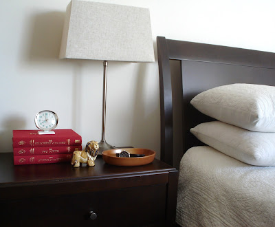
I do love learning something new, don't you?  As part of my bedside table redo which I wrote about here, I had a pair of lamps that were beginning to look a bit the worse for wear.  I had picked them up at Pottery Barn years ago. They were good quality, they still worked and the bases were a neutral silver tone nickel so I decided to keep them.  However, the parchment shades that they came with had yellowed slightly over time and I was tired of the cone shape.  I searched high and low for replacement shades but the wire frame of the old ones were unusual and I could not find any shade with a similar frame.  Have you ever seen a frame like this?


I discovered that, nowadays, most lampshades have a "spider" frame which requires a base with a harp and a finial to secure the shade in place.  Obviously, my lamps didn't have a harp and finial.  I tried recovering them but that was a disaster.  I won't show you what happened because you'd probably fall off your chair laughing.  I jumped online (as one does) to see if I could find lampshades with the weird configuration that mine had.  No luck.  As I was moodily searching around online, staring at countless lovely lamp shades that would never fit onto my lamps and contemplating having to throw away perfectly good lamps, quite by accident, I saw something that made me sit up.  This something was called a clip-on lamp shade adapter!


What!  Why had I never heard of such a thing?  It would have saved me hours of fruitless searching.  This deceptively simple piece of hardware allows you to convert a lamp without a harp to one that fits a lamp shade with the ubiquitous spider frame.  Plus if you are like me and have a fondness for vintage lamps, you know that a lot of vintage lamps don't have a harp and require a clip on lampshade.  The lamp shade adapter allows you to convert such lamps as well.  No more being stuck with a fantastic vintage lamp that's crowned with a tattered ugly shade.  I ended up rushing out to Rona to get mine but I'm sure you can get them at any hardware store.  They are so easy to install.  Just clip them on to a lightbulb (not CFL bulbs with the twisted shape) and that's it!  Next step was to find new lampshades.  I wanted something rectangular or square as they were going on bedside tables.  Rectangular shades have a smaller footprint as they can be butted up against a wall.  I wanted a bit of colour as the wall behind the bed is light and I wanted them to stand out a bit. I ended up finding the perfect ones at Walmart of all places.


This is "his" side of the bed.  It's hard to see but the shades are a natural, sand toned linen with a rough texture.  I was looking at shades with colour and pattern for a long time but ended up with fairly neutral ones. 


You'll notice the adapter is a brass tone and the base is nickel silver.  I did think of spray painting the adapter silver but wasn't sure if that was a good idea as the clip-on part is in direct contact against a very hot bulb.  I would like to find a nicer finial at least but as it is somewhat hidden, it isn't a priority for now.  I am thinking of painting the wall behind the bed an accent colour so a neutral shade would "pop" against an accent wall.  I know that accent walls generate divided opinion and much heated discussion in the decor world.  What do you think of accent walls?


I am so pleased that I was able to rejuvenate the lamps.  I adore the rectangular shape as I think it has a more modern look.  Plus if I am ever brave enough to attempt recovering a lampshade again, I think the straight lines of a rectangle will be a lot easier to handle.  I love a quick and easy DIY, don't you?


Monday, 8 April 2013

Playing with Colour & Pattern in the Menswear Department Plus Blogiversary Giveaway Winners

Are you a colour and pattern scaredy-cat?  I am!  There are lots of tips and suggestions out there on how to incorporate colour and pattern into one's decor scheme.  But, if you are like me, it all goes out the window in a huge incoherent mess when you are standing in the decor department staring at shelves of cushions.  Then, when I was out browsing in the menswear department of Banana Republic with Monsieur, it occurred to me that inspiration was right in front of me.  Trying to pair a tie with a shirt verges on the realm of a mystical science but there is method to the madness.  Let's take a look at how they style their mannequins.


Do you see how the striped tie is layered on top of the plaid shirt?  It seems like a bold move but  because both are in the same colourway, it looks chic, classic, almost conservative.  Here's another example,


Above, Banana Republic has layered a lilac polka dot tie on top of a lilac gingham shirt and a solid lilac sweater.  Again because it is all in the same colourway, the polka dots and gingham play off each other and works wonderfully.  What do you think?  Below is an example of using bright and dark colours against each other to make the bright colour really pop.


Now, let's go for a virtual walk in the mall and check out how the menswear department in J. Crew styles their mannequins.  See how on the left mannequin, there is a purple paisley handkerchief (or pocket pouf) tucked into the breast pocket which is playing off the purple gingham shirt?


Here is another J. Crew mannequin.  Monsieur wouldn't be caught dead in these Post-It note yellow pants and, if he ever did wear them, I would cross the street and pretend I didn't know him.  But, you can see that J. Crew is using the same strategy of making a bright colour pop even more by pairing it with a dark jacket.


I decided to foof my nightstand (which is a work in progress) with my takeaways from the menswear department.  I had recently thrifted a watercolour painting and a very large brass pineapple which I was just dying to display somewhere.


It is the first time I've ever bought original artwork and I was so nervous about it. But, looking at the watercolour just makes me happy as there is such a peacefulness about it.  And it reminds me of the Canadian wilderness. 


I like how the gold glamminess (is that a word in the decor world?) of the crazy pineapple plays off the gold tones in the painting and in the frame.  It is just so Hollywood Regency.  The blue egg crate pulls out the blue sky in the painting.  Plus it is very useful for holding jewelry.  I haven't been able to identify the artist as the signature is a little blurred.  If you have any information, please let me know.


I'm a very visual person and having the mannequins in front of me providing visual cues really helped give me lots of inspiration.  Who'd have thought there could be so much to learn in the menswear department for those of us who don't wear ties?  I'm working on the lamp so there will be more photos to come.
Now, let's move on to the Blogiverary Giveaway winners!  I did the draw using a vintage pink Pyrex bowl (as one does).


First prize winner of the Austrian kitchen set is:


Congratulations Six Balloons!
Second prize winner of the vintage handkerchiefs and vintage Boucher brooch is:


Congratulations Jill from A Little Bit of Everything!

Please contact me with your address so I can get your prize in the mail.
Thank you to all those who entered.  I had so much fun putting together the prizes that I'm definitely going to do more in the future.  So watch this space for more Giveaway fun! 

Monday, 1 April 2013

Blogiversary Giveaway

Do you find that life slips by in a blurry stream and that days just meld into each other?  I don't really keep track of the passing of time.  I used to keep a journal as a child but stopped in adulthood.  Do you journal or scrapbook?  I've come to realize that blogging has become a wonderful substitute for journaling.  It's such a great avenue to record certain events in my life and fulfills a lot of creative outlets.  Recently, out of curiosity, I checked to see how long I've been blogging.  I was absolutely staggered to find that I've been doing it for a little over 2 years! 2 years!  If you've been reading my blog, you'll notice that I've changed the design a bit.  After 2 years, I was feeling the need for a new look.  So to celebrate the new look and the passing of 2 years, I think a blogiversary giveaway is in order, don't you?  And because I talk a lot about using vintage in the home, of course the giveaway has to feature vintage goodness.  First up is what I'm calling a medley of Austrian kitchenalia.  The winner will receive an Austrian wall hanging featuring a recipe for apple strudel with a border featuring peasant/folk art/country life, an Austrian oven mitt with a recipe for Farmer's Feast on the back, and 3 cloth coasters.


Second prize is a collection of 6 vintage handkerchiefs tied with a chocolate brown grosgrain ribbon and pinned together with a vintage Boucher bow ribbon brooch.  Boucher was a Canadian costume jewelry company which I think is appropriate as I'm based in Canada.


All the hankies have some sort of white detail such as embroidery or trim.  To enter the giveaway, leave a comment.  Which prize is your favourite?  Like L'Heure Bleue At Home on Facebook for an extra entry.  Just come back to the blog and leave another comment letting me know that it's your second entry.  I'll keep the giveaway open until Sunday April 7, 2013, Midnight EST.  And yes, the giveaway is open internationally.  Here's to another 2 years!

This Giveaway Contest is now closed.


Thursday, 21 March 2013

Green In My Life For 2013

I am sure you've heard by now that Pantone's colour of the year is emerald green.  Green is such a funny colour isn't it?  It can take on some many oppositional meanings such as new growth, Spring or jealousy and envy.  I've written about the colour green before, here, but it's been on my mind lately especially when I received a  letter from a particular credit card issued by a certain bank named after a Canadian city.  It said that I hadn't been using my credit card enough and, if I didn't start using it more, they were closing it down.  What???  I thought that, after the global financial crisis, the trend was to get people off the credit card wagon, not browbeat them back on it.  As I told the hapless client representative, if the cc company is worried I've switched over to the competition, there are more effective ways to get me back.  I see the green-eyed monster in the company's eyes, don't you?  I've had this card for longer than the age of the client rep so it wasn't a case of me being in arrears, simply that I wasn't using it enough for their liking.  So, in a grumpy mood, I went off to the local mall to see what I could charge up.  I went into Banana Republic and saw this dress.


Banana Republic Peggy Knit Shift Dress

Hmmm, I don't think I am brave enough for this dress.  Monsieur really liked the clean crisp lines of this shift dress below though.


Banana Republic Tipped Shift Dress
I liked it too.  I do think one has to be careful with an all green outfit as there is the danger of looking like Kermit the Frog.  I think the trick is with the addition of accessories to break up all the green.  However, this frugal girl really wasn't keen on being forced to part with her green and thus go sliding into the red, if you know what I mean.  So I went off to Old Navy and ended up getting this.

Old Navy Patterned Shirt

Of course, I had to go thrifting in order to recover from all that out of character retail shopping.  I picked up this vintage Swedish cast iron enamel casserole dish.


I've never seen cast iron enamelware in green before as I'm used to the traditional "hot" colours of red or orange that you often see in Le Creuset.  There was something about the green accents that really spoke to me.  And, I love the naive quality of the squiggles on the lid.   I think it would look fab displayed in a kitchen.
I celebrated a milestone birthday this past week.  Monsieur gave me this amazingly huge tote bag from Banana Republic for my birthday.  It really is enormous.  He said that it was for me to fill up with treasures when I go thrifting which I thought was really sweet and thoughtful as thrifting bores him stiff.


Switching out your decor or wardrobe whenever fashion changes can be pricey so I find that the easiest way to stay on trend is with the addition of accessories.  I like adding little touches like a scarf to a bag to personalize it.  But even relying on accessories may not be feasible if you are on a really tight budget.  So the easiest, fastest way to inject green into your decor is with....plants!


I have met people who think green is an unlucky colour and avoid it at all costs.  But plants are a part of Nature and it is a great way to bring life indoors. So if green is not your favourite colour, plants are a safe "neutral option."  What do you think of green?  Embrace or avoid?

This was not a sponsored post.  The tote was a gift and I just really liked the shirt.


Related Posts Plugin for WordPress, Blogger...