About L'Heure Bleue At Home

Shop Photo Gallery

Offers and Discount Codes

Showing posts with label DIY. Show all posts

Tuesday, 27 October 2020

How to Choose the Right Paint Colour

 Hello Friends!  I hope you are safe and healthy wherever you are.  We are in deep in the Second Wave and modified Stage 2 Lockdown here.  Even though I knew the Second Wave was coming, I admit that I lost a bit of my mojo for awhile and decided to take a break from home projects..  Hands up if you are experiencing emotional fatigue.  Thankfully, I had done quite a fair amount of painting already before my mojo dissipated as I had just can't imagine spending all that time and effort right now picking out the perfect paint colour.  Here are my tips and suggestions for picking a paint colour that you will be happy to live with for years to come.

First of all, I always use Benjamin Moore paint.  I just have not found another brand that is its equal in terms of spreadability and coverage.  I have tried more affordable paints in the past but it wasn't worth it in the long run as I ended up spending more time and effort applying the paint and then needing more of it. I wanted to repaint a section of the front hallway that was opposite to a feature wall that was painted with North Sea which is a deep, midnight blue.  I needed a colour that would marry well with the rich tones of North Sea.


Obviously, as everyone does, I looked over an ever growing stack of paint chips. However, you don't want to stop there. I also used the Benjamin Moore website where you can see what the paint colour looks like in various rooms. You need to think about where the paint colour is going to be applied.  Is it a high touch, high contact area?  The hallway was a high touch area and was looking scruffy with lots of fingerprints and stains.  Would a washable finish be more suitable?  Benjamin Moore has announced the colours of the year for 2021.  The Colour Trends of 2021 Palette is a great jumping off point for inspiration.  How a paint colour reads on the wall can change not only with the ambiant light in that area but any colours that it is placed with.  There is no natural light in my hallway.  Any lighting is mainly from LED bulbs which gives off a cool toned light.  Incandescent bulbs tend to give off a warm toned light.  Initially I thought a pale grey would work with North Sea.


You would think this would be a straightforward process but nooooooooo.....! This is where the magic of colour sampler tins comes in.  Benjamin Moore offers colour samplers for around $11.  I went mad picking out paint samplers to try out on the wall beside the feature wall.  There are so many variations of pale grey with greys that have a blue, green, brown or pink undertone.  In the above photo, you can see different patches beside the feature wall. Would you believe that they are all variants of grey?  But no matter what shade of grey it was, when placed adjacent to the feature wall, it would pick up a blue tinge.  All of them were too pale to hold their own against North Sea.

Finally, after a great deal of hand wringing and staring at a section of wall that was beginning to look exactly how I was feeling (ie bonkers), I went back to a colour that I have used before, Hiking Trail.  The only way I can describe it is that is a warm milk chocolate.  It is the same colour that I have used in the kitchen and as a feature wall in the living room.  It has enough depth of colour to stand up to North Sea.  


I have a section of wall in the hallway that has a pair of watercolours hung on it so Hiking Trail makes a good backdrop to those paintings as well.  That is another consideration that you might want to bear in mind as well.  Do you have any artwork on the wall?  I liked the fact that I was using a colour that had been used in other areas of my home because I am a big believer in a sense of continuity in a home.  Paint colour is a great way to establish a sense of flow in a home especially if you have a small home like I do.

I think what really decided me on Hiking Trail was the fact that, when I stood at one end of my home, I was able to envision an enfilade of feature walls.  So that is another tip I have for you which is to stand at different vantage points in your home.  I don't think that I had ever stood at that point in my home, as depicted above, and really thought about what I was seeing.  That wall at the far end used to be a light sand colour, Manchester Tan, the same colour that you see on the left.  It didn't really make the artwork pop.  I love how there is a feature wall in the foreground and then a matching feature wall in the background.  I will say that I wasn't prepared for how much darker it felt in the hallway.  All the paint colours come with an LRV which is the Light Reflective Value. Manchester Tan, for example, has an LRV of 64.41 whereas Hiking Trail has an LRV of 24.78. So the LRV of a colour is another consideration to weigh up.   I love Hiking Trail in the front section of hallway adjacent to the feature wall painted with North Sea but, to be honest, the jury is still out about the section of hallway that you see in the background.  I am used to it now but one day I might switch it back to a colour with a higher LRV.

I hope you have found these suggestions useful.  Please chime in if you have any other tips.  


Monday, 20 July 2020

Budget Friendly Kitchen Makeover How To During Lockdown

Hello Friends!  I hope that, wherever you are, you are slowly emerging from lockdown.  The city that I live in is still in Stage 2.  Now that we are have been spending so much time at home, the comforts of home have never been more important.  Finally, I have the time to attend to those repairs that have been  pushed to the back burner for years.  Although I would love to gut everything and start fresh, my minuscule budget didn't allow for it.  Not only that, I had no idea how to manage social distancing with any contractors that I hired as I live in a condo and not a spacious home.  The kitchen cabinet doors were in dire need of repair but I had 15 (!!) cabinet doors and 4 drawer fronts to contend with, all of various sizes.  I checked budget friendly sites like Ikea to see if I could purchase new doors but I was unable to find anything that was even close to the sizes that I needed.  After much research, I turned to Amazon, who is fast becoming my new bestie, and ordered several rolls of matte white veneer.


I chose matte white because the kitchen doesn't have any source of natural light and I felt that white cabinet doors would help to bounce light around.  There are a variety of textures and colours available, such as a faux wood but the veneer is essentially a plastic contact paper so I figured that faux wood would look...well...glaringly faux.
The cabinet doors have to be clean of any grease or dirt.  Trust me when I say that even the tiniest speck of dirt will cause an air bubble to form around it. I was pleasantly surprised  to see that the rolls were made in Germany so I was assured of quality.  There are grid lines printed on the backing paper to help you cut straight lines.  Keep the backing paper on until you begin to apply it.  If you completely remove the backing paper before application, there is a greater likelihood of air bubbles forming.


I used a rolling ruler to help smooth down the veneer as I was applying it.  I pressed down firmly on the ruler while holding the veneer up and away from the ruler.  I found that the backing paper peeled away on its own simply from the forward motion of the ruler.  I used a utility knife to trim off the excess around the edges.  
You can reposition it a few times if you find that you have made a mistake but the more you manipulate it, the greater the chance of air bubbles forming.  I had a can of spray glue at the ready but I found that I didn't need it.  Any air bubbles can be gently massaged away.  Remember to pull it tightly around the edges as air bubbles tend to form along the edge.


Refinishing the cabinet doors actually went quickly once I became familiar with how to apply it.  The fact that the doors are flat without any moulding or protruding trim really helped.
The next thing I tackled in the kitchen was the blue bulkhead.  The blue stripe running along the top of the upper row of cabinets had always vaguely bothered me.  It had been painted blue a long time ago on the advice of a real estate agent but I just found that it had no relation to the other elements in the kitchen at all. During my lockdown decluttering efforts, I found a barely touched pint can of paint in a closet along with brand new rollers and brushes.  Finding that can of paint, in the same shade as the rest of the kitchen, was like finding gold.  No need to mask up and go to the hardware store with the sign on the door that said "5 minutes max."  I don't know about you but I am fairly certain that no one in the history of humankind has ever been able to choose a shade of paint and get it mixed up in under 5 minutes.  I had everything I needed to paint over that blue stripe without spending a dime!
Before:

After:


I am so pleased with how it turned out.  The kitchen looks modern and refreshed and has a more cohesive look. The rolls were around $19 each and I needed 6 rolls.  Expensive for what is essentially contact paper but much cheaper than getting new custom doors.  I think that this is a good option if you are a tenant or if you are looking to refinish cabinetry on an extremely tight budget and have no prior experience or special DIY skills.  You don't need any special tools except a pair of scissors, a utility knife and a ruler or something similar.  Best of all, it was a project that kept me occupied and sane during these troubled times.


Monday, 9 October 2017

LBH Weekly Roundup: Roots Canada Crossbody Bag, Integrated LED Track Light

Time for another Weekly Roundup!  One of the few cons of a capsule wardrobe is that items tend to wear out with greater frequency simply because they are on constant rotation.  I love a crossbody bag because it leaves my arms free and distributes the weight across my body.  Sadly, I noticed the straps on my old bag were getting really worn and it was looking the worse for wear.  So it was a great thrill to pick up this Roots bag this week.


It has so many outer and inner pockets.  I don't know about you but I love pockets.  It is made of woven suede instead of smooth leather so I don't have to worry about scuffs and scratches.  The "Peace" symbol embroidered onto the toggle adds a fun 60's hippie touch.  Monsieur was quite surprised when I brought it home as I have never really channeled the hippie look before but I was really taken with the quality and construction of the bag and the many, many pockets.  With the sudden onset of Autumnal temps, I have been fleshing out my Autumn capsule wardrobe and this bag came at just the right time.  If you want me to write a post about my capsule wardrobe and how I put mine together, let me know!
This weekend was Thanksgiving in Canada.  Now, you know when you have hit a rut in your relationship when you spend a long weekend at Home Depot contemplating the omnipresent DIY list...alone.  Monsieur was nowhere to be found.  A ceiling light fixture had stopped working a long time ago and I was determined to tick off my list.  With both of us dealing with health issues and one of us disabled, trying to replace burnt out ceiling light bulbs is akin to asking us to climb Mt. Everest.  I picked out an integrated LED track light.  


The wonderful thing about an integrated LED light fixture is that it never needs its light bulbs replaced!  It is Energy Star certified and should last 50,000 hours. So over the course of its lifetime, there should be significant savings in electricity consumption, not to mention light bulbs being prevented from going into landfill.  Monsieur did lend a helping hand with installing it and, reno rookies that we are, we lived to tell the tale.  I am sure if you had seen us wobbling back and forth trying to attach the wires, you wouldn't have known whether to laugh, cry or run far away.  
And that's it for this week.  Happy Thanksgiving to my Canadian readers!

This is not a sponsored post.  


Thursday, 25 April 2013

Easy Lampshade Conversion

I do love learning something new, don't you?  As part of my bedside table redo which I wrote about here, I had a pair of lamps that were beginning to look a bit the worse for wear.  I had picked them up at Pottery Barn years ago. They were good quality, they still worked and the bases were a neutral silver tone nickel so I decided to keep them.  However, the parchment shades that they came with had yellowed slightly over time and I was tired of the cone shape.  I searched high and low for replacement shades but the wire frame of the old ones were unusual and I could not find any shade with a similar frame.  Have you ever seen a frame like this?


I discovered that, nowadays, most lampshades have a "spider" frame which requires a base with a harp and a finial to secure the shade in place.  Obviously, my lamps didn't have a harp and finial.  I tried recovering them but that was a disaster.  I won't show you what happened because you'd probably fall off your chair laughing.  I jumped online (as one does) to see if I could find lampshades with the weird configuration that mine had.  No luck.  As I was moodily searching around online, staring at countless lovely lamp shades that would never fit onto my lamps and contemplating having to throw away perfectly good lamps, quite by accident, I saw something that made me sit up.  This something was called a clip-on lamp shade adapter!


What!  Why had I never heard of such a thing?  It would have saved me hours of fruitless searching.  This deceptively simple piece of hardware allows you to convert a lamp without a harp to one that fits a lamp shade with the ubiquitous spider frame.  Plus if you are like me and have a fondness for vintage lamps, you know that a lot of vintage lamps don't have a harp and require a clip on lampshade.  The lamp shade adapter allows you to convert such lamps as well.  No more being stuck with a fantastic vintage lamp that's crowned with a tattered ugly shade.  I ended up rushing out to Rona to get mine but I'm sure you can get them at any hardware store.  They are so easy to install.  Just clip them on to a lightbulb (not CFL bulbs with the twisted shape) and that's it!  Next step was to find new lampshades.  I wanted something rectangular or square as they were going on bedside tables.  Rectangular shades have a smaller footprint as they can be butted up against a wall.  I wanted a bit of colour as the wall behind the bed is light and I wanted them to stand out a bit. I ended up finding the perfect ones at Walmart of all places.


This is "his" side of the bed.  It's hard to see but the shades are a natural, sand toned linen with a rough texture.  I was looking at shades with colour and pattern for a long time but ended up with fairly neutral ones. 


You'll notice the adapter is a brass tone and the base is nickel silver.  I did think of spray painting the adapter silver but wasn't sure if that was a good idea as the clip-on part is in direct contact against a very hot bulb.  I would like to find a nicer finial at least but as it is somewhat hidden, it isn't a priority for now.  I am thinking of painting the wall behind the bed an accent colour so a neutral shade would "pop" against an accent wall.  I know that accent walls generate divided opinion and much heated discussion in the decor world.  What do you think of accent walls?


I am so pleased that I was able to rejuvenate the lamps.  I adore the rectangular shape as I think it has a more modern look.  Plus if I am ever brave enough to attempt recovering a lampshade again, I think the straight lines of a rectangle will be a lot easier to handle.  I love a quick and easy DIY, don't you?

Sunday, 26 June 2011

Frame Me Up a.k.a. My First Time Spray Painting

I have another shocking "first" to share with you.  I've never spray painted before!  The impetus that caused me to pick up a can of spray paint for the very first time was the sad state of my bathroom mirrors in the guest and ensuite bathrooms.  They were ordinary plate mirrors that were glued to the wall.  Removing them for fancy-pants framed mirrors would have meant smashing them off the wall.  And I very much wanted some way of fancying up the bathrooms as neither of them had windows and so no natural light source.
Here is the guest bathroom mirror as it's former unadorned self:

I purchased two lengths of moulding,  a can of Rustoleum Spray Paint in Hammered Silver and a tube of adhesive from Home Depot.  Total cost was under $30.  As it was my very first time, my technique got better as I went along.  Long, even, sweeps worked well.  I did find that, more than 2 coats, and the hammered effect was lost.
Here are both mirrors all fancied  and framed up:

Ensuite:

For under $30, this is a whole lot of fancy.


After it was all done, I admit I had a Titanic moment when I wanted to shout "I'm Queen of the World!" whilst waving victoriously the spray can in one hand.   But this could have been the paint fumes talking.  My euphoria almost equalled the high I felt on using a power tool (an electric staple gun) for the very first time which you can read about here.  Sigh, another milestone reached.  I wonder what's next?

And if you want to know how is it that there are so many "firsts" with me then go to the "About L'Heure Bleue At Home" tab wherein you will learn all about a 6'4" man throwing a tantrum in my living room, my vintage things hanging their heads in shame and 70's brown polyester curtains.


Tuesday, 21 June 2011

Come On In, Take A Seat

I have a confession to make that will shock all the semi-pro DIY'ers out there.  Before this year, I had never owned or operated a power tool!  Yes, never!  The impetus that, ultimately, changed this grievous state of affairs was a vintage table and set of 4 chairs that my father bought many years ago.  I was never very fond of it as it was a little too "country" for me and I secretly wanted something more "rock and roll".  Lately, I have grown more fond of it because it has so many memories of family dinners embedded in it.  And now that we are all grown and scattered to the four winds, this little set has found its home with me.  Do you have pieces that evoke such memories for you?  The problem was that the upholstery looked decidedly drab.  So I took the plunge, bought an electric staple gun after quizzing the clerk at Rona for 15 minutes, picked out a lovely retro-inspired fabric, new batting and set to work.  Here is a chair that's been recovered beside one that hasn't.

And yes, I emerged unscathed with my fingers intact.  While the table still remains its original humble self, it has a mighty secret.  Inside its belly is cunningly concealed an extra leaf that swings up and out so that the table can seat 6.  How clever is that?

Do you think I should repaint the set or keep it the original duck egg blue?  The paint work is in fairly good condition but it is obvious that the set has been well enjoyed and has come by its "distressing" honestly.  Should I paint it white?  Or go for modern glam black?  Your opinion would be greatly appreciated.
I admit that I had so much fun with my staple gun  that, after I was done, I wanted to run around the house stapling everything!  Now I know why the boys love their tools so much!


I think this little country table and chairs is ready for another twenty years of memories, don't you?

I'm linking up to  A Beach CottageFree Pretty Things, The Shabby Chic Cottage , Simple Home Life, Serenity NowMy Romantic Home and Diy By Design.


Tuesday, 17 May 2011

The Heart of the Home

Do you remember looking forward to "show and tell" at school?  Would you like to know what I have been doing lately?  I hope so as I would dearly love to do a bit of show and tell!  I have been renovating my kitchen which was in dire need of a surgical intervention.  It has been a long and arduous process circumscribed by a budget the size of this ===> .
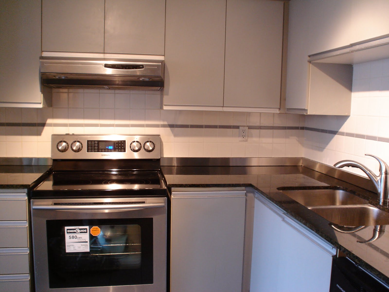
I had replaced the stove, refrigerator and fume hood already in this photograph:
Due to budgetary reasons, the cabinetry and tile flooring had to stay for the time being.  Because of these elements that were staying, any new additions had to work with the existing colour scheme.  The people who lived here before me used the laminate countertop as a chopping board and it was in a sad state.  The porcelain sink was stained and scratched and the faucet was a drippy mess.  A granite countertop, stainless steel double sink, new faucet and dishwasher was installed.

I bought the countertop, sink and faucet from Home Depot.  At Home Depot, granite comes in different price brackets.  In my price range, I only had two choices.  One was a peachy pink which was clearly not an option.  The other option was the one I chose.  It looks black from far away but is actually made up of very dark green, iridescent clear, white, black and amber chunks.  When I look at it, I am reminded of a river rushing over pebbles.  It gives the space a warmth and depth that balances the severity of the stainless steel and grey tones.  When the old countertop was taken away, it left a gap where the partial laminate backsplash used to be.  I couldn't find any combination of tile to fit that gap.  Then in a moment of inspiration, I came up with the idea of having a custom made stainless steel backsplash to fit that gap.  Initially, the contractor I had asked to help me fabricate it brushed away my idea and I noticed he did so time and again with many of my ideas. Nonetheless, I prevailed and am so pleased with the result as it echoes the stainless steel appliances, the grey strip of tiles further up the back wall and was a cost effective solution that saved me the bother of retiling the entire backsplash.  I wanted to weld the old and the new together and still achieve a cohesive look.
 
When I started renovating my home, I was full of uncertainty but determined to try.  I had never owned, much less operated a power tool before and often had to rely on Google to show me what to do.   And I discovered that this journey has become a journey of self-discovery.  The process has pushed my creativity, imagination and resourcefulness to the limits.  At times, it has been difficult to stay true to my artistic vision in the face of doubting naysayers but that can be said about many aspects of life, wouldn’t you agree?
And they do say that the kitchen is the heart of the home.  Now I can say that the heart of L'Heure Bleue At Home has been refurbished, mended and sewn back together with care.  And, if I could, I would like nothing more than to invite you over for tea.

I am linking up to A Beach Cottage and Good Life Wednesdays.

Tuesday, 19 April 2011

Silver Bells and Cockle Shells

I have a secret to tell you. The abode of L’Heure Bleue At Home is nothing more than a glorified concrete box. Let me add that I am not writing this from a prison cell. And the concrete box was looking a little worn and a little torn. And when one is living in a glorified concrete box then worn, torn walls start to emphasize the concrete-boxy-ness of L’Heure Bleue At Home. I wanted a bit of the colours of the sky inside L’Heure Bleue At Home to make me forget that I was living in a concrete box. But I despaired of ever being able to finish painting the place and bring the sky into my home. There were too many walls to complete. “I am going to live with these scruffy walls forever,” I said, “It is all very, very bad.” This is when one of my best friends said, “I will help you paint.” Miraculously, she came and we painted and painted and painted. Where possible I used Benjamin Moore’s Natura paint with its “zero VOC” and “virtually no odour” because, when one is living in a glorified concrete box with not a lot of ventilation, preservation of one’s lungs and much-needed brain cells is an important concern. And the only way I knew how to repay her was to cook dinner and serve it on my Very Best China reserved only for Very Special Occasions.
And to cheer us up and gladden our hearts, I dressed up the table with silver bells and beachy shells. Alas, there were no pretty maids in a row as we were in our painting clothes and covered in paint splodges.
We sat down to dinner with legs trembling from exhaustion. And somehow, after a long day of hard labour, saying Grace doesn’t seem like such an antiquated notion after all. And so I say with all due sincerity, “For the good food on our plates, for friends who pick me up and carry me over the finish line, for friendship, loyalty, love and all the ties that bind and for readers, commentors and followers who cheer me up and cheer me on, Thank You. Thank You. Thank You.”
I am linking up to A Beach Cottage and Good Life Wednesdays. I noticed that the Followers gadget isn't working on this blog. On some other blogs hosted by Blogger, there is a message under the Followers gadget saying that there is a problem with Internet Explorer. Could you let me know if you see any Followers? I am not sure if it's a problem with Internet Explorer or with Blogger. Thank you!

Saturday, 2 April 2011

The Beginning

A journey begins with taking the first step .  And the first step with L’Heure Bleue At Home began with the realization that I could paint Grandma’s Dresser and make it into something I loved.  Let me backtrack a little.  My parents are practical people.  They never painted or renovated any of the many houses that they lived in.  They just fit themselves into the past lives of the previous occupants.  Inadvertently, that became my modus operandi.  My life became filled with furniture I disliked, fixtures and fittings that niggled at the corners of my mind.  My mother foisted all of the furniture she had no use for on to me which included Grandma’s Dresser.  It was a hideous monstrosity of faux country awfulness.  It lived like a carbuncle on my life.  My mother refused to take it back, all the while filling me with guilt for wanting to get rid of it.  Finally, it dawned on me that I had the power to transform it.  So I painted it a pure white and added lovely, sparkling carved crystal knobs.  What a revelation.  Hampered as I am with a budget that is so tiny that you would need a microscope to see it and no Mister to lend knowhow and muscle, the dam had broke and there was no stopping me.   I was bewildered by the plethora of styles, colours and textures laid out before me.  Did I like mid-century modern, French country or rustic?  Dark colours or light?  So let’s start this journey of self-discovery.  Care to follow along?
Related Posts Plugin for WordPress, Blogger...